# Yet Another React Lightbox
Modern React lightbox component. Performant, easy to use, customizable and
extendable.
## Overview
[](https://www.npmjs.com/package/yet-another-react-lightbox)
[](https://bundlephobia.com/package/yet-another-react-lightbox)
[](https://github.com/igordanchenko/yet-another-react-lightbox/blob/main/LICENSE)
- **Built for React:** works with React 18, 17 and 16.8.0+
- **UX:** supports keyboard, mouse, touchpad and touchscreen navigation
- **Preloading:** never displays partially downloaded images
- **Performance:** preloads limited number of images without compromising
performance or UX
- **Responsive:** responsive images with automatic resolution switching are
supported out of the box
- **Video:** video slides are supported via an optional plugin
- **Zoom:** image zoom is supported via an optional plugin
- **Customization:** customize any UI element or add your own custom slides
- **No bloat:** never bundle rarely used features; add optional features via
plugins
- **TypeScript:** type definitions come built-in in the package
- **RTL:** compatible with RTL layout
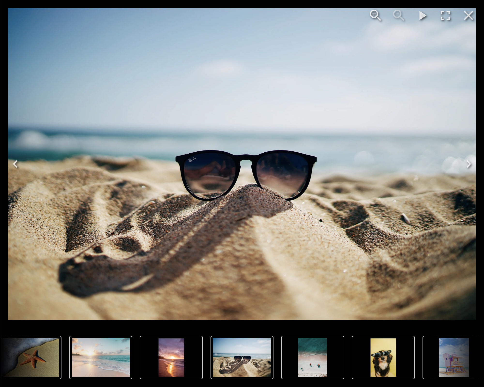
## Documentation
[https://yet-another-react-lightbox.com/documentation](https://yet-another-react-lightbox.com/documentation)
## Examples
[https://yet-another-react-lightbox.com/examples](https://yet-another-react-lightbox.com/examples)
## Installation
```shell
npm install yet-another-react-lightbox
```
## Minimal Setup Example
```jsx
import * as React from "react";
import Lightbox from "yet-another-react-lightbox";
import "yet-another-react-lightbox/styles.css";
export default function App() {
const [open, setOpen] = React.useState(false);
return (
<>
setOpen(false)}
slides={[
{ src: "/image1.jpg" },
{ src: "/image2.jpg" },
{ src: "/image3.jpg" },
]}
/>
);
}
```
## Recommended Setup
Unlike many other lightbox libraries, Yet Another React Lightbox doesn't have a
concept of "thumbnail" or "original" (or "full size") images. We use responsive
images instead and recommend you provide multiple files of different resolutions
for each image. Yet Another React Lightbox automatically populates `srcset` /
`sizes` attributes and lets the browser decide which image is more appropriate
for its viewport size.
```jsx
import * as React from "react";
import Lightbox from "yet-another-react-lightbox";
import "yet-another-react-lightbox/styles.css";
export default function App() {
const [open, setOpen] = React.useState(false);
return (
<>
setOpen(false)}
slides={[
{
src: "/image1x3840.jpg",
alt: "image 1",
width: 3840,
height: 2560,
srcSet: [
{ src: "/image1x320.jpg", width: 320, height: 213 },
{ src: "/image1x640.jpg", width: 640, height: 427 },
{ src: "/image1x1200.jpg", width: 1200, height: 800 },
{ src: "/image1x2048.jpg", width: 2048, height: 1365 },
{ src: "/image1x3840.jpg", width: 3840, height: 2560 },
],
},
// ...
]}
/>
);
}
```
You can also integrate 3rd-party image components (e.g., Next.js Image or Gatsby
Image) via a custom render function. See
[examples](https://yet-another-react-lightbox.com/examples) on the documentation
website.
## Plugins
Yet Another React Lightbox allows you to add optional features to your project
based on your requirements via plugins.
The following plugins are bundled in the package:
- [Captions](https://yet-another-react-lightbox.com/plugins/captions) - adds
support for slide title and description
- [Counter](https://yet-another-react-lightbox.com/plugins/counter) - adds
slides counter
- [Download](https://yet-another-react-lightbox.com/plugins/download) - adds
download button
- [Fullscreen](https://yet-another-react-lightbox.com/plugins/fullscreen) - adds
support for fullscreen mode
- [Inline](https://yet-another-react-lightbox.com/plugins/inline) - transforms
the lightbox into an image carousel
- [Share](https://yet-another-react-lightbox.com/plugins/share) - adds sharing
button
- [Slideshow](https://yet-another-react-lightbox.com/plugins/slideshow) - adds
slideshow button
- [Thumbnails](https://yet-another-react-lightbox.com/plugins/thumbnails) - adds
thumbnails track
- [Video](https://yet-another-react-lightbox.com/plugins/video) - adds support
for video slides
- [Zoom](https://yet-another-react-lightbox.com/plugins/zoom) - adds image zoom
feature
## License
MIT © 2022 [Igor Danchenko](https://github.com/igordanchenko)